Advertisement (Remove Ads?)
TF2HudPlus
Downloads:
25,278
Views:
138,148
Rating:
Description
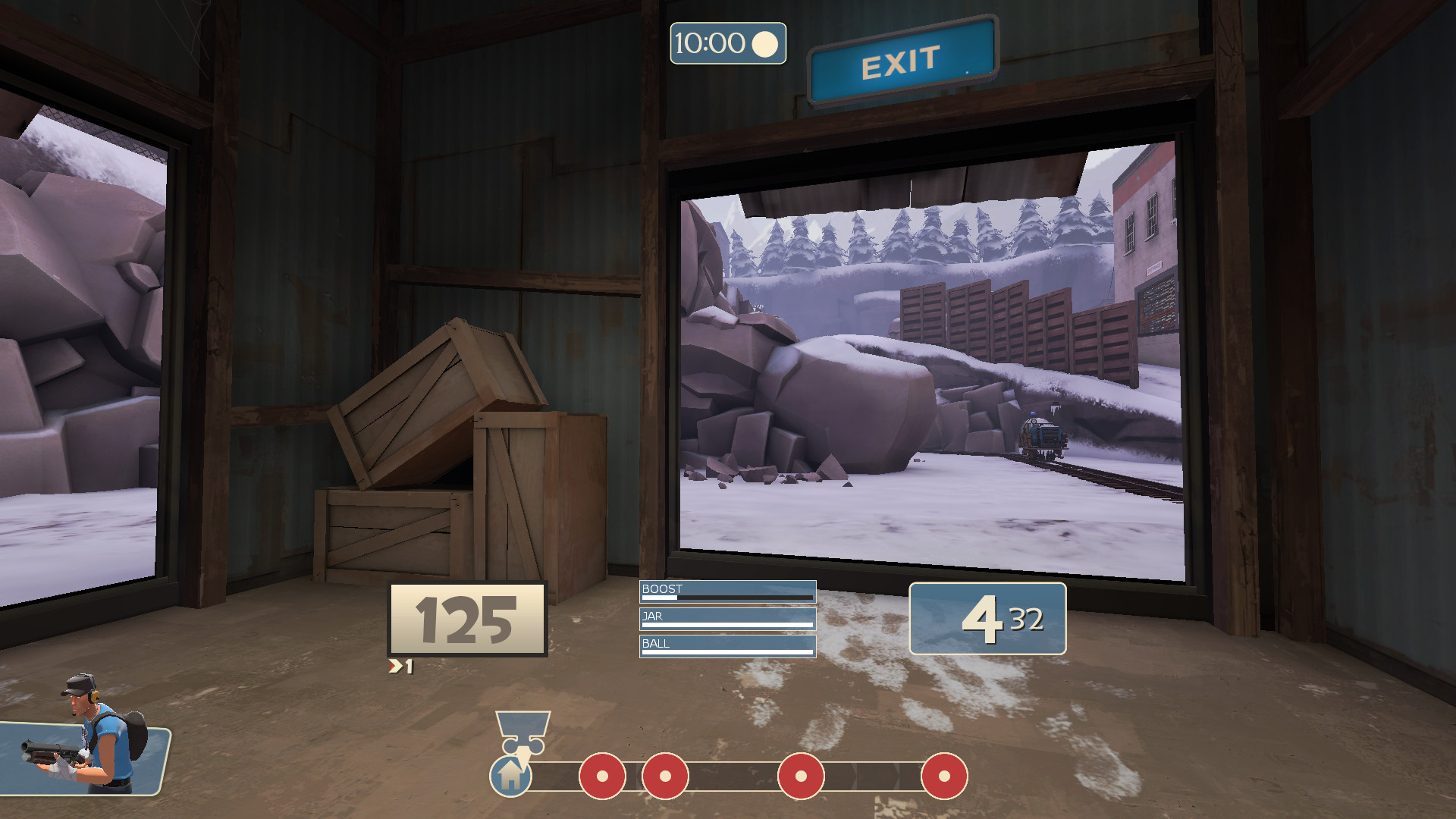
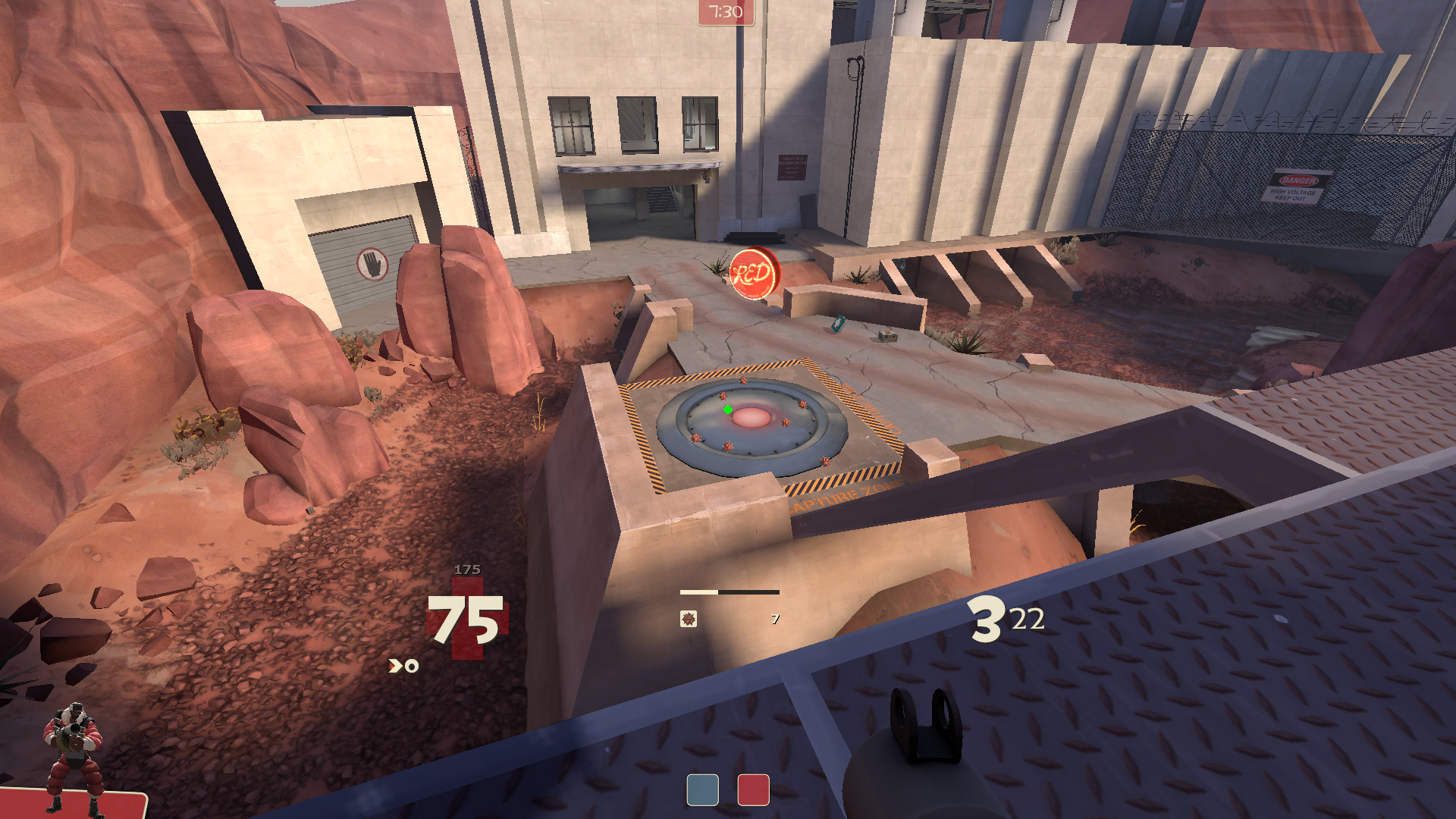
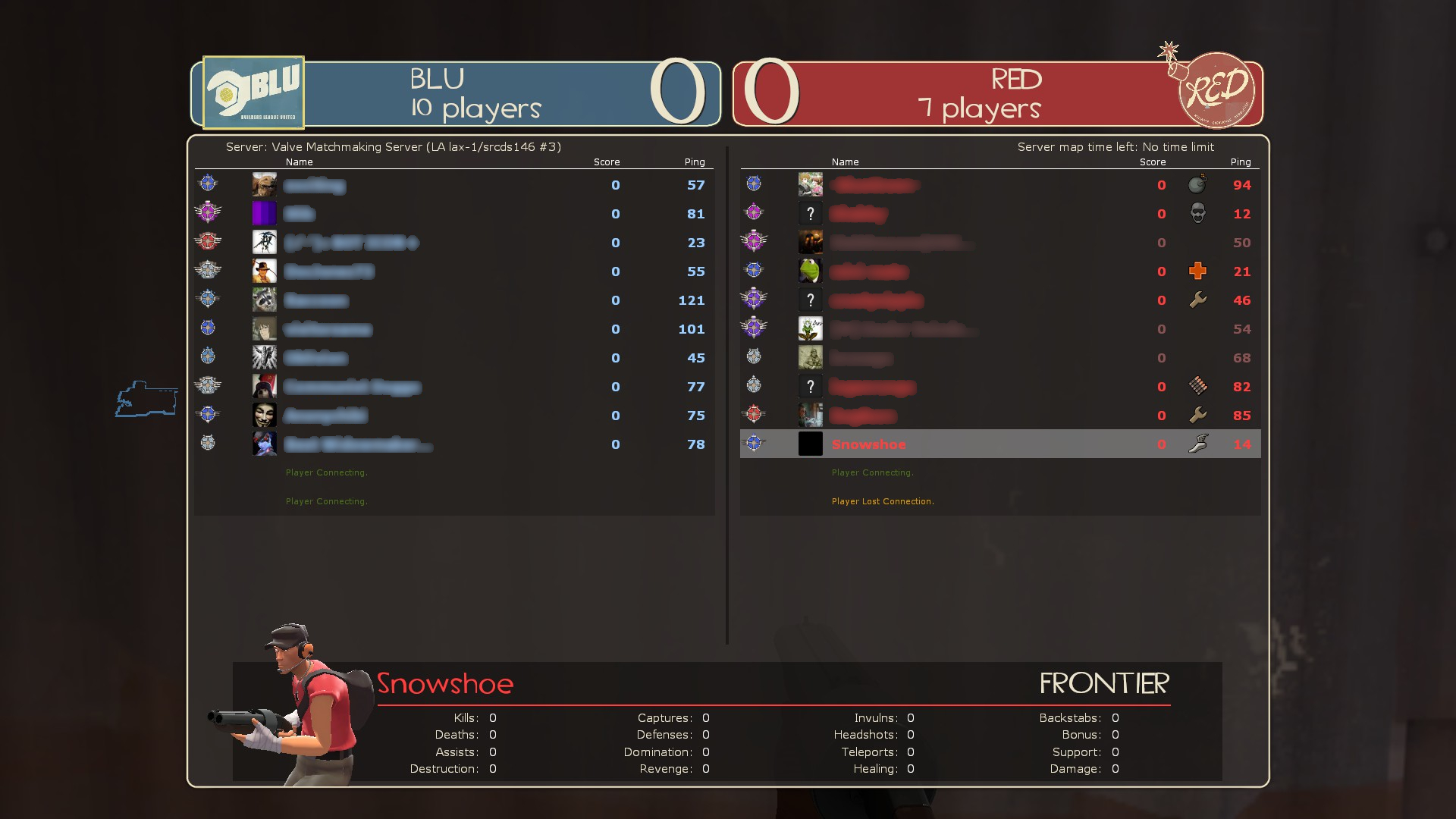
TF2HudPlus is a stock HUD modification that adds new features and fixes to the original HUD.
New features include:
- Centered health, ammo and charge bar HUD (minimal HUD supported).
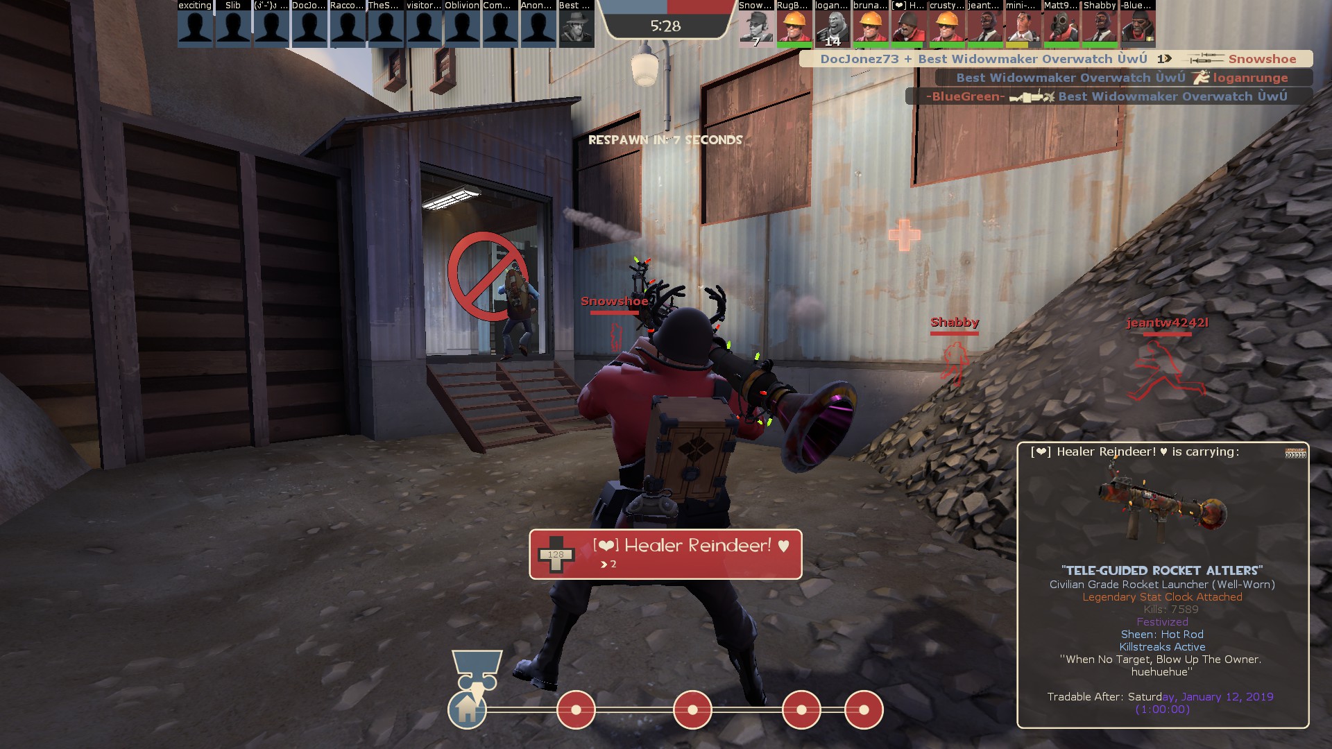
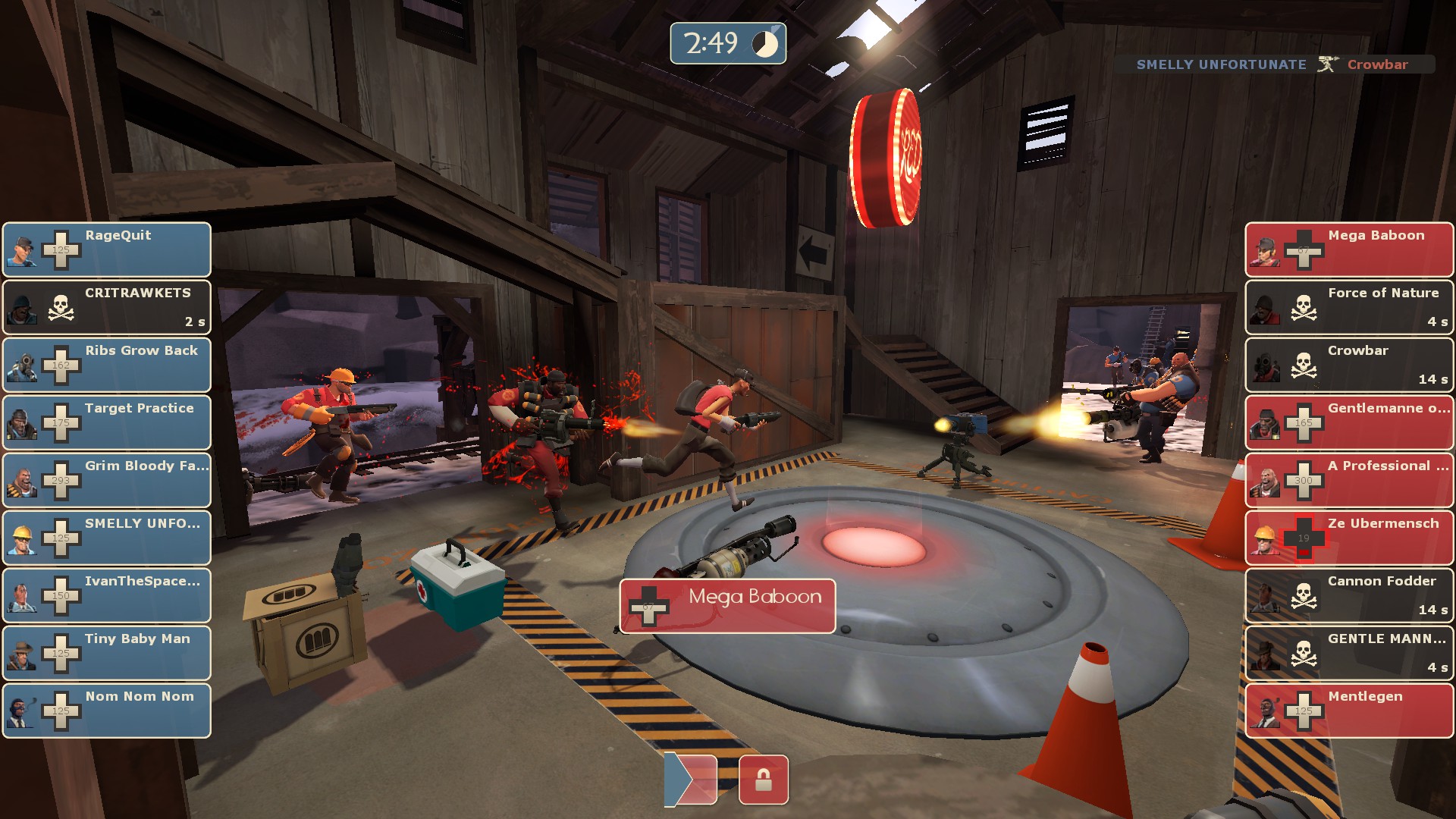
- Bigger matchmaking HUD with added player names.
- Gun Mettle scoreboard design with 32 player support.
- Tournament spectator HUD with left and right columns (6v6 and 9v9 supported).
- Redesigned quickswitch menu to fit more items.
- Casual Mode stats and a bigger friends list on the main menu.
- Change teams and camera position on class loadout (hold RMB, SHIFT, ALT or CTRL for different functions).
- Zoom support added to item inspection and store screens.
- Close button, page buttons and fast hotkeys in loadout menus.
- 32-player trading list for trade servers.
...and a lot more quality of life changes and fixes over the default HUD.
AUTO-UPDATER! Run "extract_base_hudfiles_tf.bat" in the HUD folder.
Special Thanks
wiethoofd (wiethud), eniere (imhud), nemesis (hllib), sigsegv-mvm, jotunn (kbnhud), omp (omphud)
| Operating System | Supported? |
|---|---|
| Windows | |
| Mac | |
| Linux |
| Resolutions | Supported? |
|---|---|
| 4:3 | |
| 5:4 | |
| 16:9 | |
| 16:10 |
| Miscellaneous | Supported? |
|---|---|
| Custom Fonts | |
| Custom Menus | |
| Extra Scoreboards | |
| HUD Crosshairs | |
| Minmode Toggle | |
| Streamer Mode | |
| Custom Materials | |
| Easy Customization |
| Gamemodes | Supported? |
|---|---|
| Tournament | |
| Competitive | |
| Arena | |
| Attack/Defend | |
| Capture the Flag | |
| Control Points | |
| Domination | |
| Halloween | |
| King of the Hill | |
| Mannpower | |
| Mann Vs. Machine | |
| Passtime | |
| Payload | |
| Payload Race | |
| Player Destruction | |
| Robot Destruction | |
| Special Delivery | |
| Territorial Control |
Centered HUD from the classic versions of TF2HudPlus is back again, with a new look.
The entire HUD has been rewritten into a modular patch-like design that can easily be updated with the included bat file. To put it simply, the custom HUD files are kept separate from the stock HUD files, which are then merged seamlessly at runtime. This future-proofs things quite a bit if Valve decides to add something.
User Comments
35 Comments
Hello, so far I am VERY happy with this HUD as it stays very close to default but still makes health and ammo easier to see, but I have a problem seeing (because of my horrible eyesight) things like: how much metal does engineer have, ubercharge and the names of all bars like boost, jar, mmmph. I would ask If you could please make them bigger or provide an option to. please , thank you
Posted 12-07-2019, 09:39 AM
underrated HUD. The minimal HUD of this is really competitive and easy to understand against the normal minimal HUD. Everything there is down to the edges of your screens while this minimal HUD shows everything either big or in the middle. Even the stock version is just better. Everything is really where it should be and while there are some big borders it's still much more noticable. PERFECT!!!!
Posted 18-03-2021, 08:30 AM
Advertisement (Remove Ads?)
