Advertisement (Remove Ads?)
AntsHUD
Downloads:
124,108
Views:
561,408
Rating:
Description
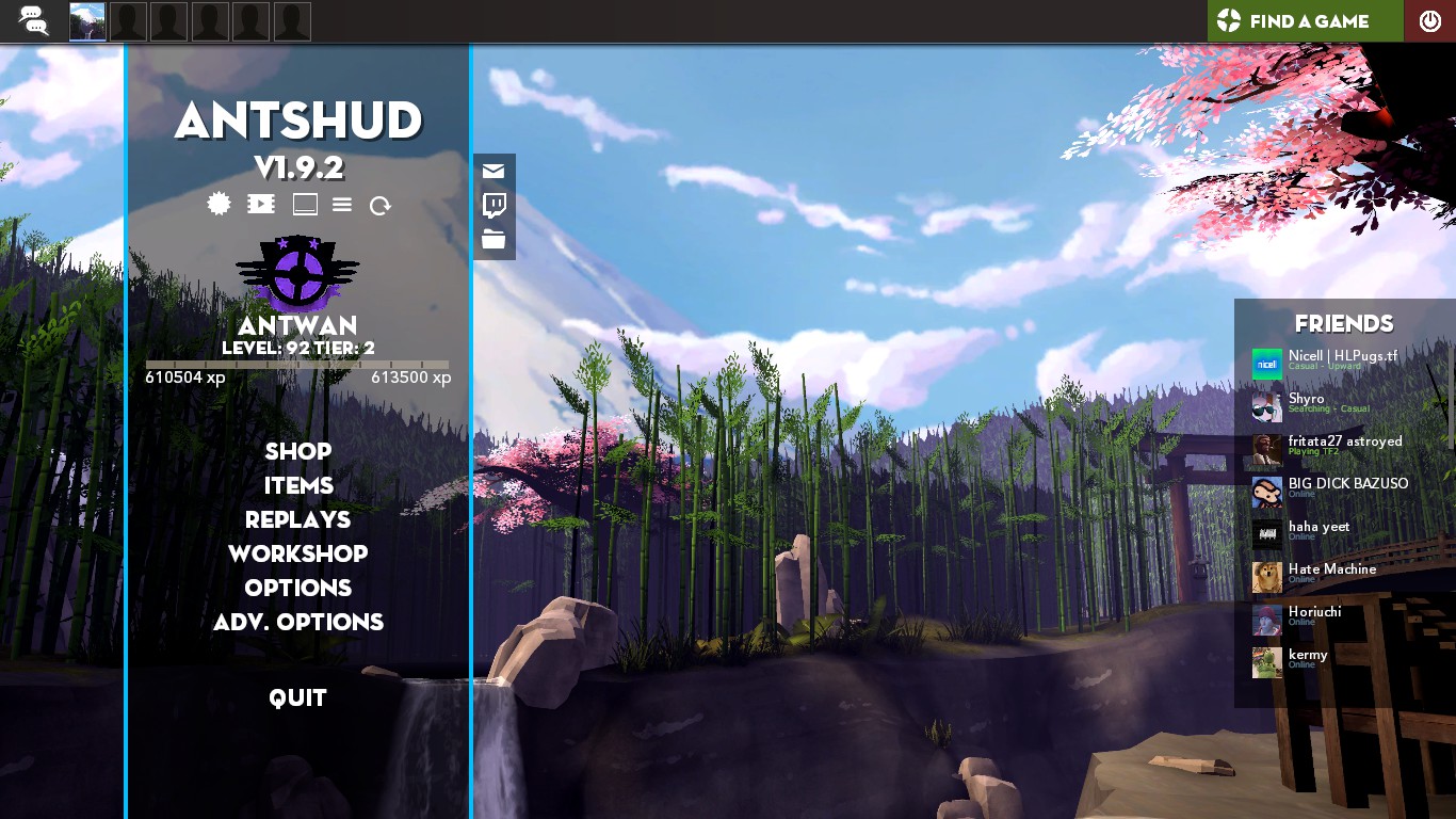
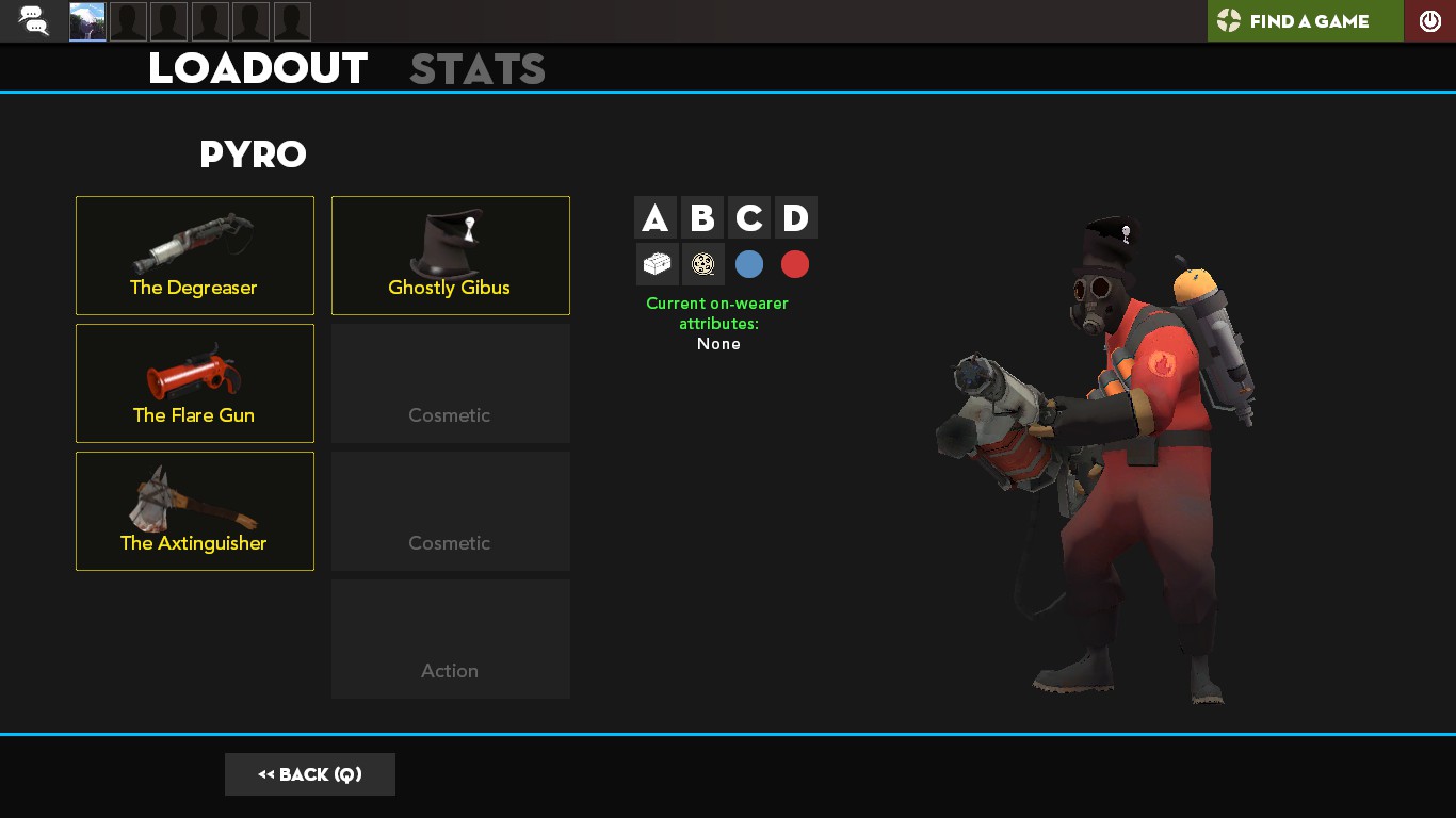
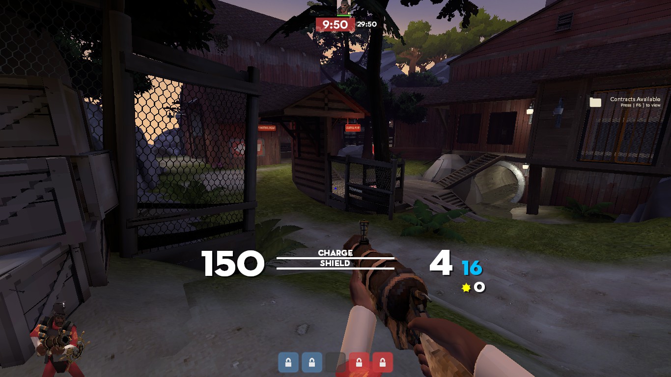
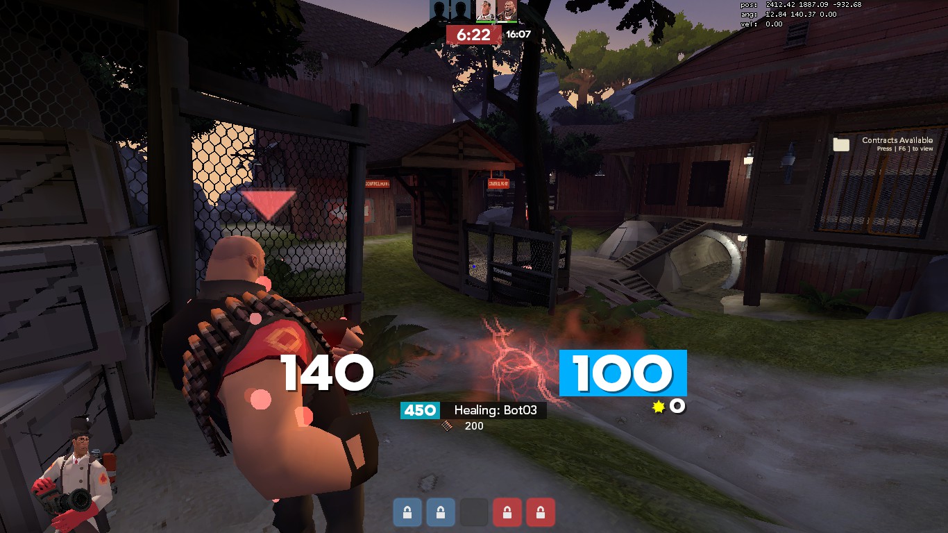
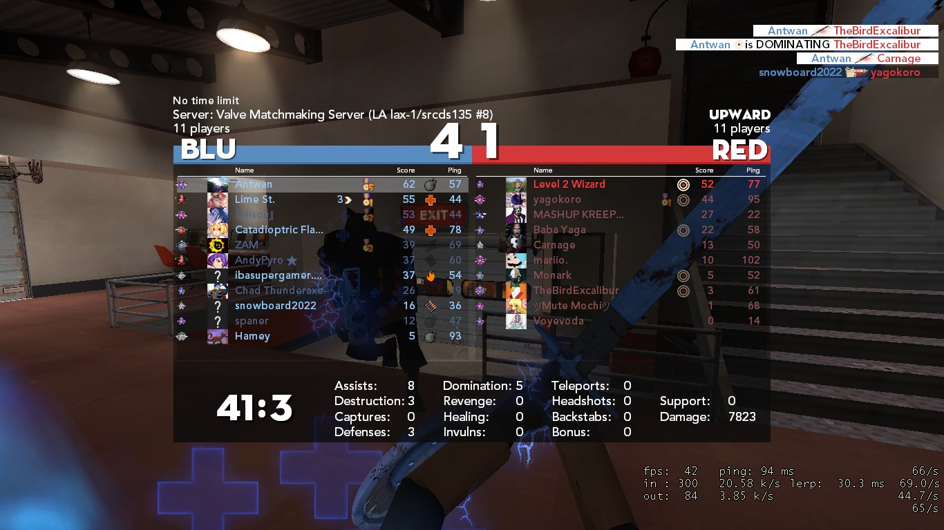
A HUD with a modern, flat, dynamic design made from a combination of RaysHUD, ahud, and ToonHUD
GitHub:
https://github.com/AsianAntwan/AntsHUD
Gamebanana:
http://gamebanana.com/guis/32745
Screenshots:
https://imgur.com/a/rHpj0ys
Steam Group:
https://steamcommunity.com/groups/antwansants
Steam Profile:
http://steamcommunity.com/profiles/76561198246200638/
Credits
Thanks for friends and HUD Users that were testing out this HUD, giving me feedback, and supporting this.
Special Thanks
Thanks to Raysfiyah and the HUD Editing Community for teaching me how to do HUD editing through YouTube.
| Operating System | Supported? |
|---|---|
| Windows | |
| Mac | |
| Linux |
| Resolutions | Supported? |
|---|---|
| 4:3 | |
| 5:4 | |
| 16:9 | |
| 16:10 |
| Miscellaneous | Supported? |
|---|---|
| Custom Fonts | |
| Custom Menus | |
| Extra Scoreboards | |
| HUD Crosshairs | |
| Minmode Toggle | |
| Streamer Mode | |
| Custom Materials | |
| Easy Customization |
| Gamemodes | Supported? |
|---|---|
| Tournament | |
| Competitive | |
| Arena | |
| Attack/Defend | |
| Capture the Flag | |
| Control Points | |
| Domination | |
| Halloween | |
| King of the Hill | |
| Mannpower | |
| Mann Vs. Machine | |
| Passtime | |
| Payload | |
| Payload Race | |
| Player Destruction | |
| Robot Destruction | |
| Special Delivery | |
| Territorial Control |
v1.9.5 | Aug. 20, 2022: Minor Adjustments & Cleanup
- Added highlight color to the Blu & Red buttons on Team Selection
- Changed highlight color on dashboard's Quit button to be red instead of sky blue
- Changed Engineer's Building progress bars to be white instead of TF2's off white
- Repositioned duel symbol, label, and player names & icons on the Scoreboard
- Repositioned and resized Team lists at the start and end of matches
- Repositioned Red's Player Destruction score drop shadow to the right
- Repositioned scroll bar in Main Menu's friends list to the edge of the screen
- Fixed TargetID Floating HP not being visible
- Fixed Spy's Concise Disguise Menu numbers not being visible
- Removed Engineer's Building Status Labels, Can be put back with a customization folder
- Removed files that are no longer being used
v1.9.4 | Aug. 3, 2022: Redesigned Matchmaking & Passtime UI
- Redesigned Gamemode selection to slide out at the bottom
- Redesigned Casual & Competitive matchmaking UI
- Cleaned up look top bar dashboard including pop out elements like party chat and casual map voting
- Fixed and slimmed down Passtime HUD
- Added a background to War Paint Inspection panel
- Resized and repositioned some fonts, labels, and elements
v1.9.3 HOTFIX | May 27, 2022: Actually Commit the Changes
- I am dumb and did not commit the needed changes for v1.9.3. It's been awhile.
v1.9.3 | May 27, 2022: Added Kill Feed Only HUD for Recording, Redesigned Thermal Thruster Element
- Added a kill feed only HUD in ^Customizations for recording purposes
- Added back the chat filter button to the top right of the chat window
- Redesigned the Thermal Thruster HUD element to look cleaner
v1.9.2 HOTFIX | Added a place holder text file for GitHub not removing #enabled folder
v1.9.2 | July 26, 2018: PD and RD Gamemodes UI Fixing, bug fixing, and new Customizations overriding system
- Revamped Customizations to be more efficient and easy to use for the creator and user as it utilizes the #base system
- Fixed and slightly revamped Player Destruction and Robot Destruction UI to be more compact and not conflict with other HUD elements
- Fixed match timer labels being cut off and moved from intended position
- Fixed chat being moved to default AntsHUD bottom left position regardless of the chat's intended position
v1.9.1 | June 30, 2018: Bug Fixing and Adding Features
- Added material preload which allows custom CP icons to be loaded on sv_pure 1 servers
- Added the ability to center Engineer's metal count in Customizations named "Centered Metal" [Suggested by LISTICK]
- Fixed Demoman Stickybomb panel being cut off in minmode [Thanks to many people reporting it!]
- Fixed Inspect panel(the panel that shows what weapon your enemy used to kill you) in killcam/freeze frame being small and shoved into a corner [Thanks Rezulux!]
- Removed sound.cache
- File clean up
v1.9 | 6 May 2018: Blue Moon Update Patch
- Fixed crashing when clicking on "Find A Game" button
- Other changes completely forgotten
v1.875 | 20 November 2017: Jungle Inferno Update Patches Changelog
-Added "Loadout" label from Items UI
-Added an armed color for combo boxes
-Redesigned Inspection Panel
-Slight Design Changes to Stats Summary both in Items UI and Map Loading
-Changed "MoreSymbols" Font Variable to be slightly bigger
-Changed background color of Sourcescheme.res to be slightly darker
-Changed "URLEntry" BG color to be "BGAnyLight"
-Changed overlaying HUD Elements to have their BG Color be "BGAnyDarker"
-Changed font and size of "LevelLabel" on the Main Menu Rank Panel
-Fixed Medal being misplaced when using different resolutions | Thanks PoorPocketsMcNewHold
-Fixed Team button labels to be cut off when using different resolutions | Thanks Elt
-Fixed Stamp check box being misplaced in Store UI
-Fixed "LevelLabel" being misplaced on Match Summary Rank Panel
-Fixed misplacement of "BossStatusPanel" on "Centered Remain Money" customization | Thanks Marooge
-Fixed "AntsHUDLightBlue" to have the same integer addition as "AntsHUDLightRed"
v1.85 | 19 November 2017 Changelog
-Updated to work with Jungle Inferno
-Misc changes I forgot after so long
v1.8 | 9 October 2017 Changelog
-Added Replay Files for future designing
-Added No Kill-Death Ratio on Scoreboard
-Added Killstreak Sign
-Redesigned Cart Checkout Panel
-Changed Shop Panels
-Changed few elements in MvM
-Fixed Positioning issues with elements
-Bunch of stuff I've forgotten
Let's hope for a better update. Apologies for this one :(
Edit: Also forgot to credit Pyrocrastinator(http://steamcommunity.com/profiles/76561198143710298) for a slight pixel line that caused people to see through the Main Menu in Items UI.
v1.75 Changelog
-Added HUD Color Customization
-Added Stats Title
-Added Recent Survey Files
-Added Slight Dark Bar for Class Pics on Loadout Screen
-Added CodeProBold font for Plus Button on Loadout Selection UI
-Added Scroll Bar on Chat
-Added No Casual & Comp. UI in Customizations
-Added shadows to some texts
-Redesigned Item Loadout UI
-Redesigned MvM Loss Panel
-Redesigned Revive Box
-Redesigned Store View Item UIs
-Redesigned Stop Watch UI for Highlander
-Changed Design on Advanced Options Menu
-Changed Positioning of Spy Disguise
-Changed & Fixed Positioning of Item Effect Meters
-Changed Size & Positiong of Spy Disguise Notification
-Changed Color of Numbers on Spy Disguise Menu
-Changed Killfeed amound and Font Size
-Changed Colors on Sourcescheme.res
-Slight Design Change to Passtime UI, Player Destruction, & Robot
Destruction
-Slight Change to Tournament Spectator UI
-Slight Ping Size on Scoreboard
-Slight Position Change on 3D Player Model
-Slight Positiong Change on Win Panel
-Slight Font Size change to Wave Complete Summary UI
-Centered Title on Engie Build/Destroy UI and Taunt Menu
-Fixed Low Quality Texture & Transparent Weapons on Class Selection Menu
(Thanks and sorry Mr. Mary & Liberage)
-Fixed Store Cart Panel
-Fixed Halloween Cart Meter
-Removed Old Suijin Background
-Code Clean up
-Color Changes
-Other things I forgot
Thank you all on this journey of supporting and giving feedback on this
HUD. Especially to RaysHUD for giving me the base HUD I needed and the
tutorials to learn. I would also like to thank the close online friends
I have who tested this HUD at some point. The Beta stage has now ended
with the help of you guys! I can't thank you enough :)
v1.7 Beta Changelog
-Added DemoUI & Console Buttons to Main Menu
-Redesigned Main Menu Background to a GIF
-Changed Paint Icon
-Changed Equipped Label
-Changed Inspection Weapons Panel
-Changed Weapon Style Panel Title
-Fixed Color Problems
-Fixed Time Added Position for Non-Casual/Comp
-Fixed and Redesigned MvM Scoreboard
-Fixed clipping of Abandon Panel
-Removed Tips from MvM Upgrade Menu
-Code Clean Up
-Other Stuff I probably forgot
v1.675 Beta Changelog
-Redesigned Weapon Inspection Panel
-Bug Fixes for most HUD Elements
-Remove Unnecessary Text from MvM Menu
v1.65 Quick-Fix Beta Changelog
-Fixed Casual being misplaced
v1.65 Beta Changelog
-Added Casual Map Voting files
-Added macOS Code to Beta Test Mac Version of AntsHUD
-Changed Design of Scoreboard, WinPanels, and Map Info
-Fixed up HUD for Smissmas 2016 Update
-Fixed Damage Numbers(Thanks [Applez]Sailor!)
-Removed Unnecessary Customization Files
v1.6 Beta Changelog
-Lighten up Color Scheme
-Redesign MvM unedited HUDelements
-Redesign Training unedited HUD elements
-Redesign Stats Panel
-Redesign Backpack & Loadout Panel
-Added in color customization Medic Bars
-Added in Centered Remaining Currency bar for MvM
-Added in ability to add Stats Panel to Map Loading
-Fixed some Bugs
-Change Positioning for some UIs
-Changed Time Status for Regular, Casual, & Comp. UIs
Special thanks for a recent helping friend!
v1.575 Beta Changelog
-Reverted Halloween back to Original Theme
-Fixed Halloween Gamemodes for future uses
v1.55 Beta Changelog
-Added Lowered UI
-Fixed some bugs
v1.5 Beta Changelog
-Added back Contracts Button and Panel
-Added buttons for Saving and Loading Casual Preferences
-Change Color Scheme to be Halloween-y(Only for Main Menu)
-Fixed Default BG of Game Modes in Casual Lobby
-Code Cleanup
v1.45 Beta Changelog
-Added Customizations suggested by AntsHUD-Beta Users
-Added Casual Survey for recent update
-Added ability to move Player Model around in the Loadout UI
-Changed Payload UI to have a clean design
-Fixed Bugs whenever found
-Organization on files
v1.4 Beta Changelog
-Updated Passtime, Robot Destruction, and Player Destruction Gamemode
UIs
-Moved HUD Animations and HUD Scheme Files to be organized
-Fixed 4:3 HeaderBackground clipping into the Main Menu
-Fixed Killfeed being overlapped under Casual & Comp. UI
-Fixed Notifications colliding with Health & Ammo UI
v1.35 Beta Changelog
-Updated Casual Rematch Voting System
-Changed Positioning of some shadows of text
User Comments
262 Comments
Well here's what I know. What you are using right now is the floating health option where the health floats above the class's head. However, the floating health element has been buggy ever since I edited the health side of the HUD when I was low on knowledge and starting out HUD Scripting. It seems that know is a good time to fix all the bugs, starting with that one. For an alternative fix while I fix the health thing, use the Target ID Bar for health instead of making the health float. You can change it in "Adv. Options" I believe.
For the Class Selection Bug, that's the view model itself. The transparent model file makes only the arms transparent which is applied to any model in the game. It can be seen in ToonHUD I believe.
You can actually remove the K:D ratio from the scoreboard but I don't know what you mean "from casual."
Finally, for the Map Selection on the Training UI, it's an easy fix, probably on my part for rushing and not caring about the Training UI(since the majority doesn't use training).
Anyways, thanks for the feedback! Expect an update sooner or later!
Merry Smissmas,
Antwan
Posted 25-12-2016, 03:46 AM
V1.7 UPDATE:
So, recently I've been able to ironed out the long, overdue bug, the no Floating Health Bug. It wasn't hard finding where it was, but it was difficult to find what WAS causing it which happened to be the RoundSignModel in hudmatchstatus.res, apparently. You probably don't care, but it's good to point out what you do to people that want to HUD Script(I really don't suggest you use my HUD as the Base HUD because it's not made for editing).
Anyways, since that's out of the way, I'm taking suggestions and feedback of bugs from you guys! If you think this needs to be change for preference or you discover a bug, comment here or in my Steam Group(or GitHub for the advanced lol. Also, have a screenshot for the bug you may find.)
MacOS:
I'm very positive the HUD will be a lot of problems for MacOS users as it probably needs repositioning and such. For that, look at my Steam Groups Announcements for a simple guide on helping fix those problems(cuz i only has windows 7 bro)!
MvM:
MvM Scoreboard is most likely I will try to change in terms of design since it was leftover from RaysHUD.
Robot Destruction, Player Destruction & Passtime(maybe):
Now you may think editing these things are a waste of time and doesn't need attention. Tell that to the minority of people that is trying to find a clean, looking HUD that supports these game modes with the Deafult HUD design of the UI. That what frustrates me the most is that a HUD is not supporting the community of all kinds. Like you play Competitively and go on Competitive game modes. Or you're the type of person that just like the near game modes like RD or PD. I rather support all than support one side and leave the other deserted. I know I sound serious, but hey that's me. ANYWAYS, I will be changing up a few things in these game modes since I tried editing the design before. It looks ok now, but I want to add more to it to look even better. For Passtime, most of the stuff is done except the Bars. They just look so ugly and big. I'll try to fix that in this update if I have time to.
And....that's about it! Expect an update sooner or later maybe a small v1.675 for the Floating Health Bug being fixed and redesigns for v1.7. Who knows?
Peace,
Antwan
Posted 27-12-2016, 09:19 AM
Comments seem a bit empty?
Well, maybe all the major bugs has been squashed. Meaning this HUD is probably really close to end of Beta!
Thanks for the feedback to the people that used this HUD & budhud for the inspiration of a GIF Background. For v1.75, I'm mostly likely focusing on redesigning Robot and Player Destruction UI. Maybe add some backgrounds behind them to not loook so empty. For Passtime, I'm probably change some and remove some things to not be so cluttery. Lastly, Tournamet UI is what I think should have the more focus on since it's something I'm not able to edit since I don't play the Community Competitve scene. If anyone would like to help, that would be appreciated :)
Anyways wait for the next update!
Peace,
Antwan
Posted 17-01-2017, 07:19 AM
What extracting method did you use? If you use extract files, it creates a folder to store whatever that was inside the zip. If you use extract here, it will directly pull out the files inside the zip. How GitHub does their Zips is when you extract the zip, it would be a folder instead of the HUD stuff inside. If you did extract files, it would create a folder and extract the folder GitHub created and it won't work since it's folder on top of folder instead of folder and hud stuff inside. With Extracr here, it'll just pull out the folder and the HUD stuff will be inside.
If that doesn't work, there's something wrong with your game in which I suggest going to the TF2 Steam properties and check it's file integrity.
Otherwise, I have no clue why it won't work for you.
I don't know if this helps, not very good at explaining XD but I do hope you understand what I'm saying.
Best Regards,
Antwan
Posted 17-01-2017, 07:48 PM
i have discovered another problem, though it is minor and does not effect anything else in the hud other then looks really weird, when using the cow mangler and any of the Banner weapons as soldier, the Mangler meter and the Banner's rage meter will overlap on top of eachother
http://i.imgur.com/ciALoBN.jpg
Posted 18-01-2017, 09:07 PM
Advertisement (Remove Ads?)
